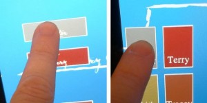
 Here’s an interesting thing I’ve learned from playing around with GUI stuff on the iPhone and iPad (and I expect this to carry over to other touchscreen surfaces as well):
On a finger-based touchscreen, it’s much easier and less stressful for a user to press buttons which are tall and narrow, than to press buttons which are wide and short.
Desktop computers and the Internet have made us all really comfortable with wide and short buttons. We think of buttons in that capsule shape because the text labels that we put into the buttons tend to be wide and short as well. But on touch surfaces, it’s tricky to see which part of a finger is going to touch the screen first, and so just precisely how high on the screen our touch is going to be. By comparison, we can be pretty certain where the touch will happen horizontally.
With the two interfaces shown here, I’ve found that it’s far, far easier for someone to press the tall+thin buttons on the right than the wide+short ones on the left, even though the buttons on the left are much larger on screen (that is, they contain more pixels).
As a fun side-note, further testing suggests to me that square buttons are best when a stylus is being used instead of a finger.
Obviously, none of this has been rigorously tested in a scientifically valid way. But in hindsight, it seems obvious that the ergonomics of finger-based and stylus-based touchscreens would work out this way.
Anyhow, just thought I’d throw it out there, in case it was a new idea to anybody else.
