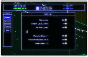
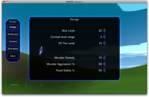
I’ve mentioned before that one of the big reasons for stopping development on MMORPG Tycoon 1.1 and jumping straight into 2.0 was that I was adding enough customisation that I couldn’t cleanly fit everything on-screen using that vector font any more. Here I’ve got a side-by-side comparison of the (current) design GUIs from MMORPG 1.0 (left) and 2.0 (right). While the vector font is definitely more stylish, and I’ve got a couple little one-pixel-out glitches in the bitmapped font drawing, you can see that I could make the bitmapped fonts smaller, or put much less empty space between lines, without sacrificing their legibility. The glowing vector fonts, on the other hand, must be drawn big, and need a lot of empty space to keep their glows from overlapping and obscuring the text.
(Note that this isn’t what I imagine the MMORPG Tycoon GUI will look like when I’ve finished with it; it’s just some minor tweaks on top of the 1.1 codebase, intended to test the bitmapped font rendering within a GUI)


